
I have a deep love of colour and of paint. I find there to be something utterly magical about a tube of paint that you haven’t yet opened.
To paint, you need colour. My personal favourite medium is watercolour. I started with a starter palette of Winsor and Newton Cotman paints. (a very long time ago). When I picked up painting again, those tubes had completely dried out and were no use to man nor beast. I was then again bought a lovely larger set of Cotman paints, which were just fab. I’m not sure where the addiction came into play, but I then bought a couple of pans of this, and then a few tubes of that, and before I knew it, I had 3 drawers full of tubes of paint. When I was preparing to stop working, I started buying up all different brands of paint, on the pretext that I would not be able to afford to buy anymore in the future. (Yes, I can always convince myself). I now have a wicker basket of packages that I need to unpack and swatch. Which is one of the reasons I have started this page. I thought it might be helpful to other watercolourists.
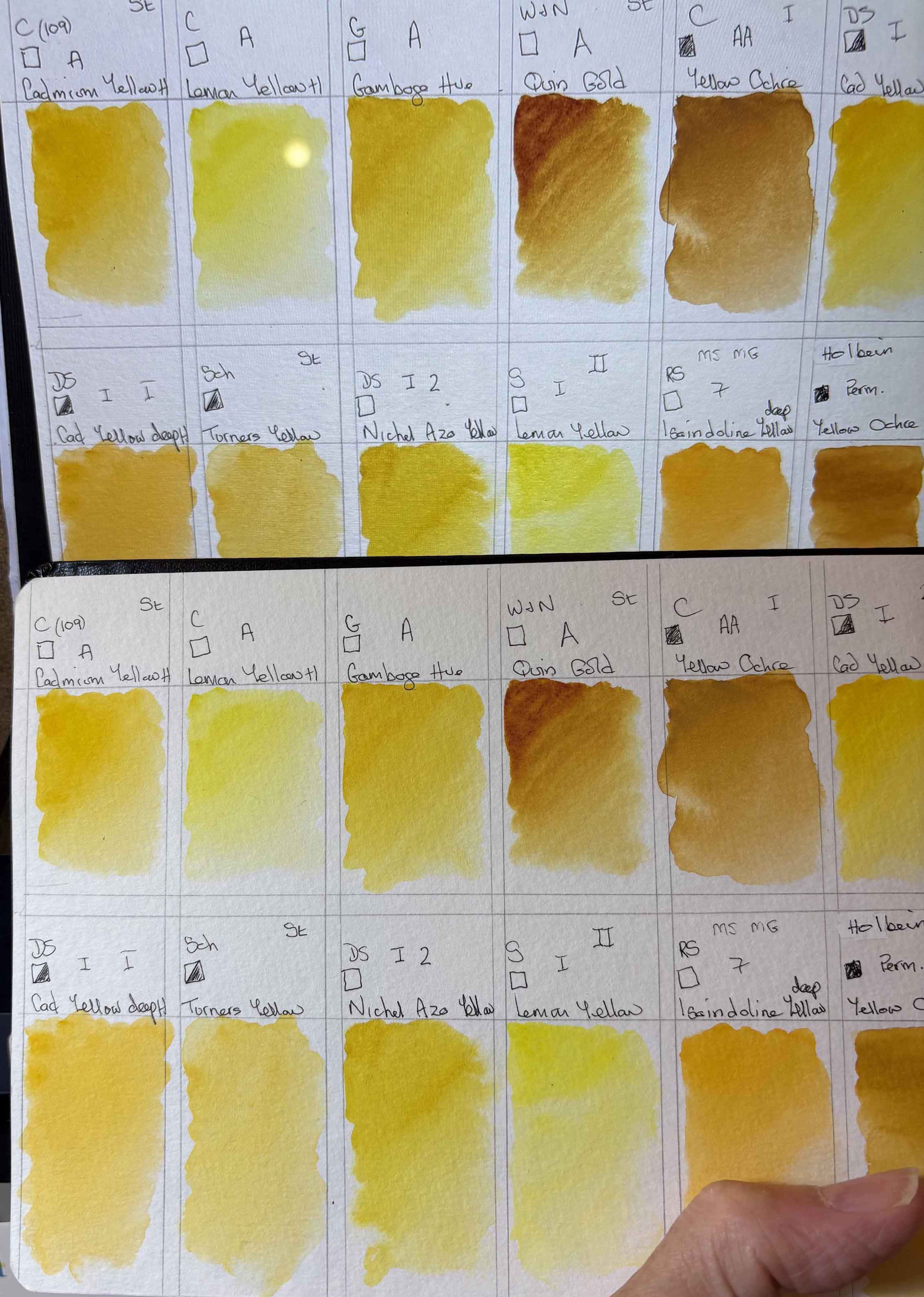
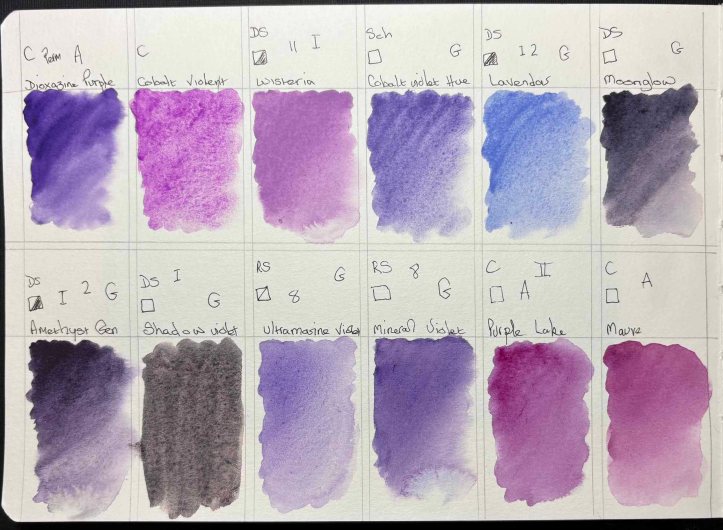
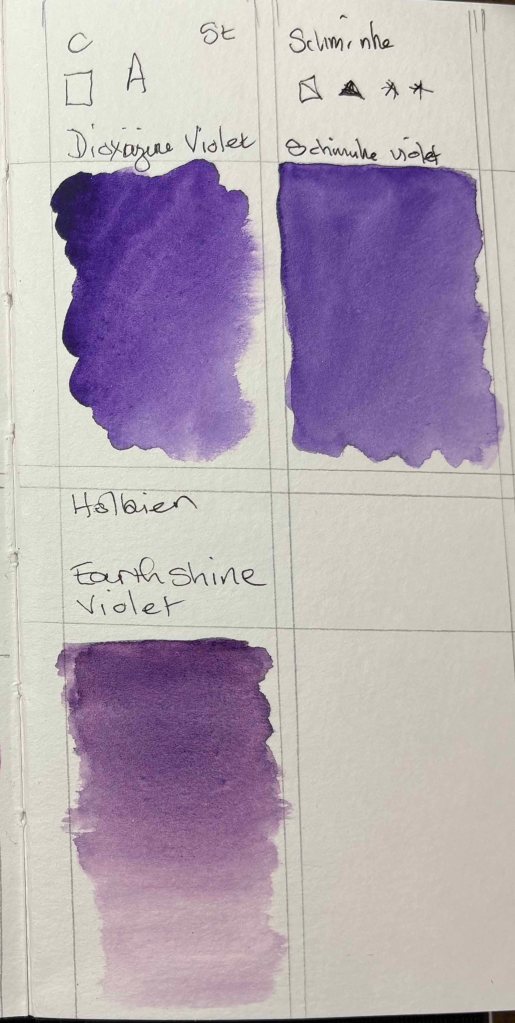
Just a quick note/warning – screens are not necessarily 100% accurate at reflecting the true colour one hopes to show. Probably a lot to do with the fact there is a glowing light behind the screen which we don’t get on the page.
I have photographed the below swatches many times to get as accurate a reflection of the paint on paper as I can. To show the slight difference, here is a photo of the swatch against the screen.
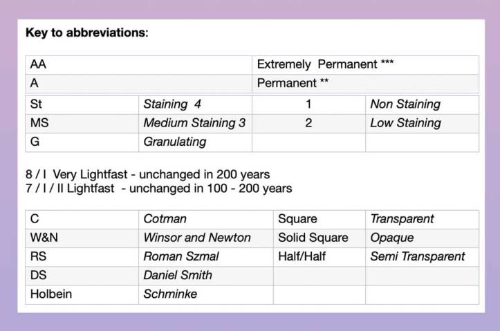
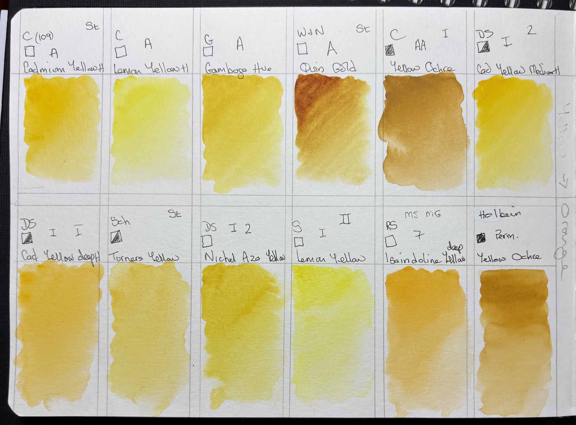
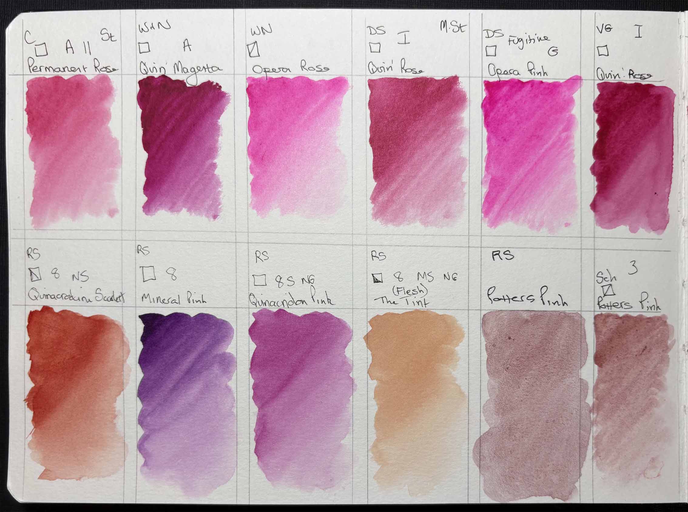
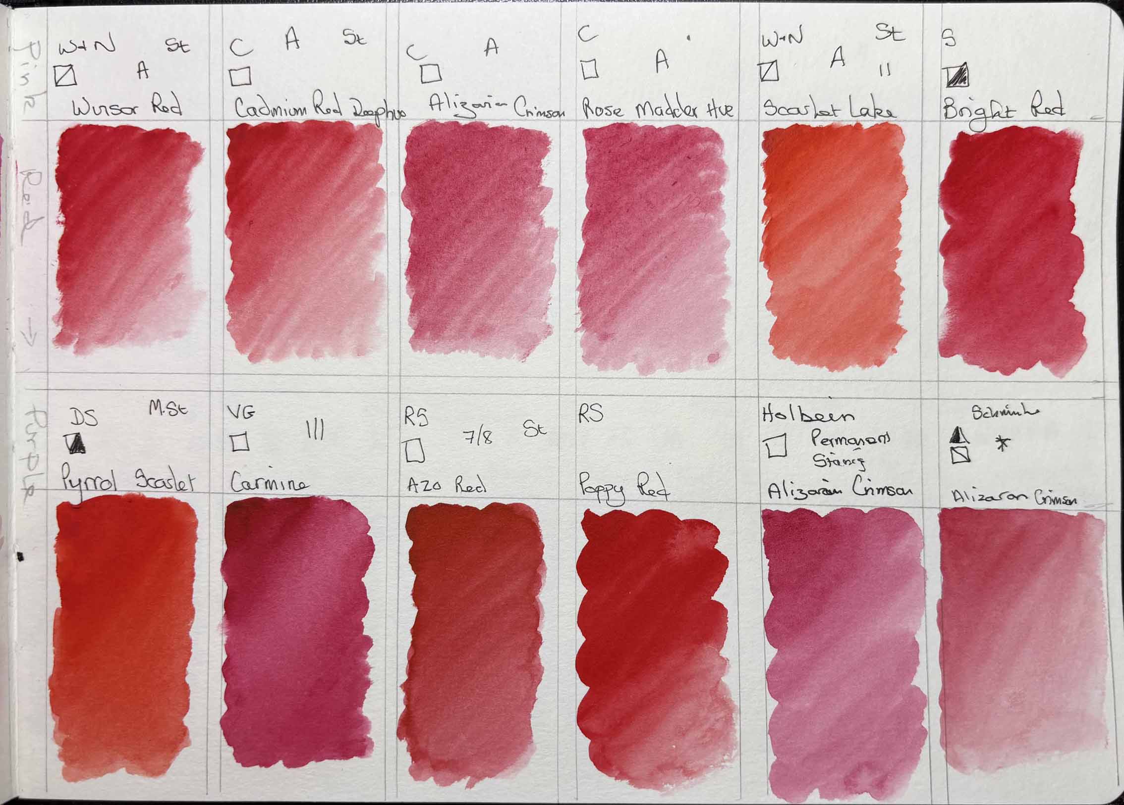
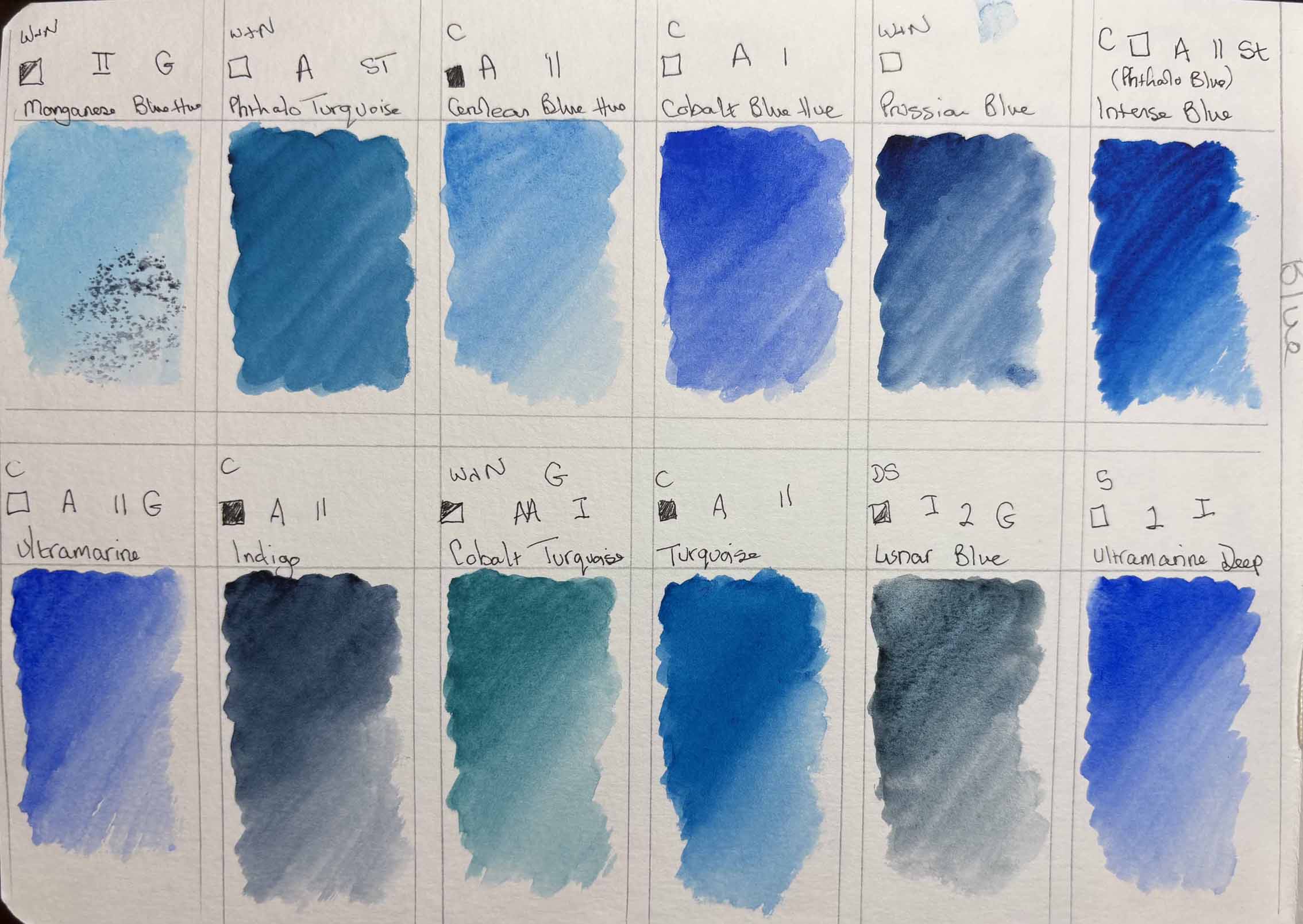
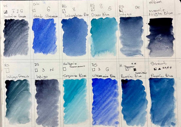
I have put a rough key below that is next to each colour in the swatches below. I do intend to update it each time I add to it, so this will probably end up being quite a long page.
Below is a bit complicated, as each brand uses a slightly different way of referencing and defining their colours.
I have separate sections for each of the main colours:
- Yellows (and Oranges)
- Reds (and Pinks)
- Blues (and Turquoises)
- Purples (and Mauves)
- Greens
- Browns
- Blacks (and Greys)
The primaries are the colours I tend to buy the most of; Yellow, Blues and Reds.
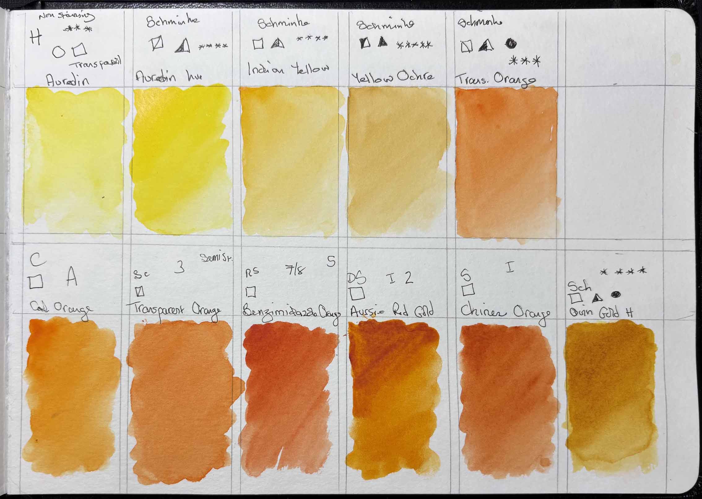
Yellows (and Oranges):
Reds (and Pinks):
Blues:
I probably favour blues more than any other colour:
Indigo! Indigo is possibly my ultimate favourite colour. I add it to so many things. Cotman’s is probably my favourite brand. However, Holbein’s Moonlit Night Blue? Wow, king of blues that little beauty, Roman Szmal’s Indigo Greenish adds a lovely patina to shadows. Prussian Blue is such a pretty colour and mixes such a lovely range of greens when adding yellows.
Again Daniel Smith comes into its own with Lunar blue, another granulating beauty.
Purple (and Mauves):
Greens:
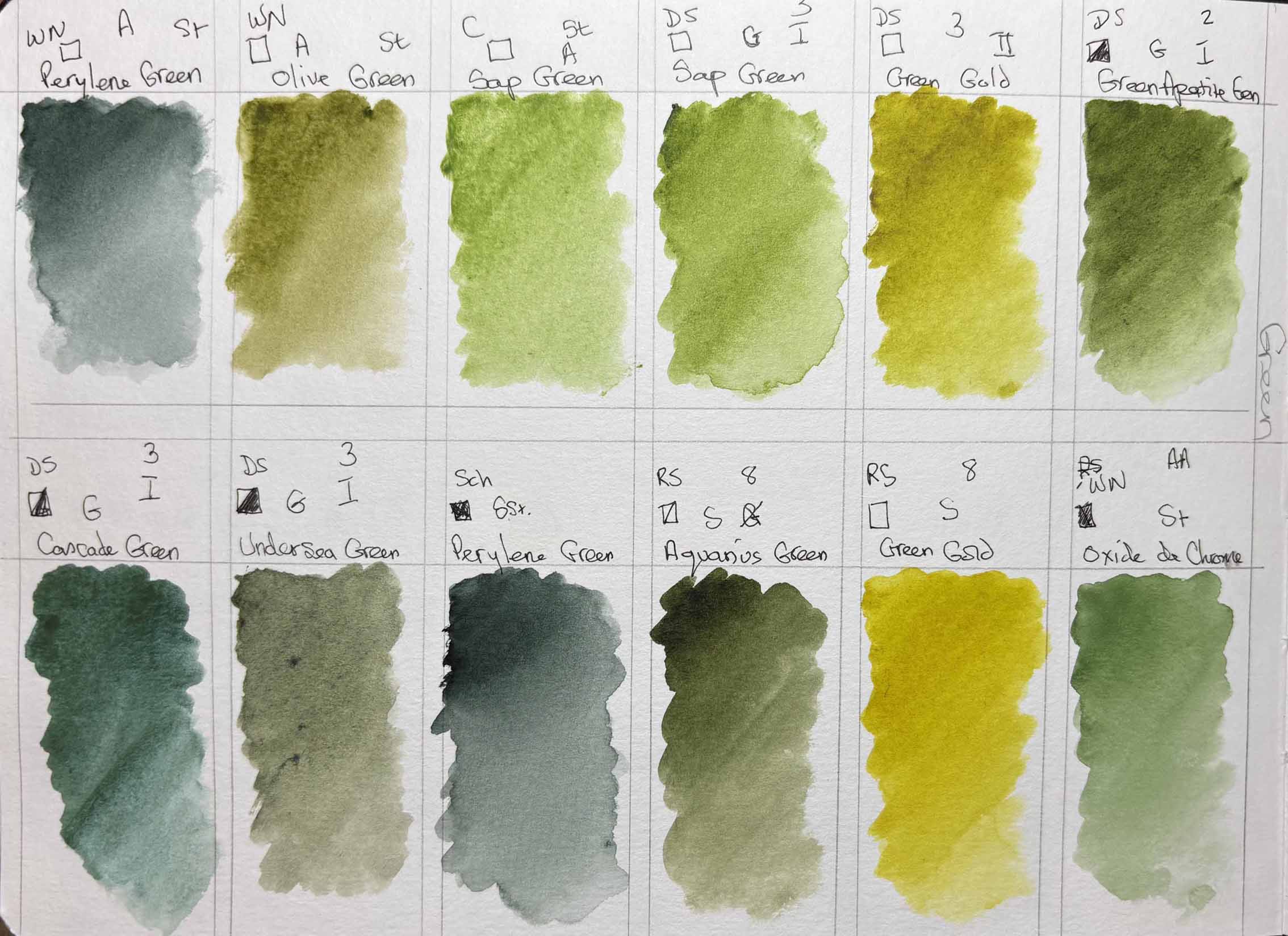
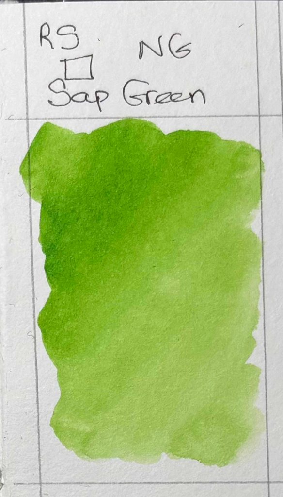
Daniel Smith’s Sap Green for me is the most natural green of all. Cascade Green is another interesting colour, I also get drawn to Undersea Green , yet another granulating colour. After that, Daniel Smith’s and Roman Szmal’s Green Gold are really useful.
Browns:
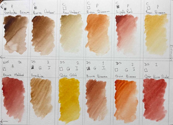
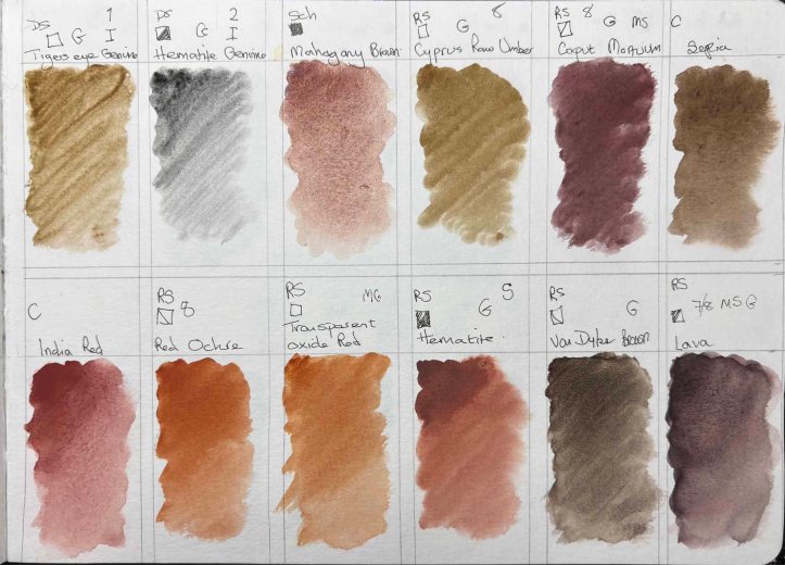
To be honest I have never really decided which I prefer from Yellow Ochre to Raw Sienna. I’m sure a colourist would be appalled, but I can’t really see much difference.
For animals – eyes etc I either make my own brown or I do like Van Dyke Brown (Roman Szmal) and Burnt Umber. When painting foxes Quinacridone Burnt Scarlett or Quinacridone Sienna gets pulled into the palette, I’ve never been able to make a brown Red that is as gorgeous as Quinacridone Sienna.
Blacks and Greys:
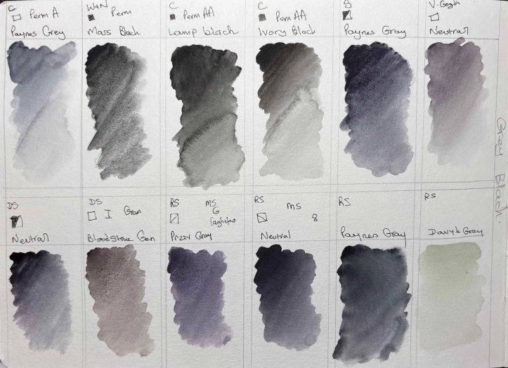
I love my Blacks and Greys.
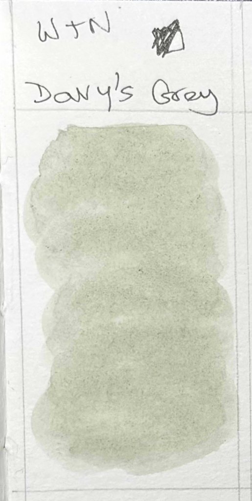
Paynes Grey – who can manage without it. Davy’s Grey (both Winsor and Newton and Roman Szmal) I have started using more and more, it’s such a delicate colour. I love Roman Szmal’s Przzy Gray, with it’s slightly purple sheen, and nearly always have a Neutral of some shade in my palette.
Conclusion
I have a problem 😉 I can’t stop buying paint. I think I would probably need to paint 24 hours a day, every day, for the next 50 years at least to ever finish using all the paint I have. However, if any of my comments above can be of any use whatsoever to anyone else, then at least it’s not all completely wasted.
If you have any questions, I’d be more than glad to answer if I can.
Happy Painting.

