What do you do when you feel you are getting stale or just getting bored with what you do? For me, it is to challenge myself (yet again) to try something that has felt very tricky in the past.
When you paint very similar subjects for a while, it can get a bit tedious. I find it helps me to challenge myself. In some ways, watercolour means every single painting is a challenge, but then there are further challenges inside. For example, painting a black or white animal.
Both of these have their own difficulties. I thought I would explain my white dog challenge that I set myself recently.
Way back, I tried to paint a white cat and a white dog. The cat pictures got ripped up very quickly.
I read and watched so many YouTube tutorials and blogs trying to figure out how to do it. But just could not get my head around how to portray an animal with white fur, without it either disappearing on the page or looking like a dirty smudge of grey.
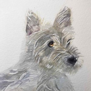
I think you can see here what the challenges were that I faced. The first set of three you can see below were from various written tutorials, or advice I’d read and for me at the time I was quite happy, but after a few days I realised they looked rubbish! And they went from my Instagram feed to the archives lol.
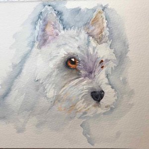
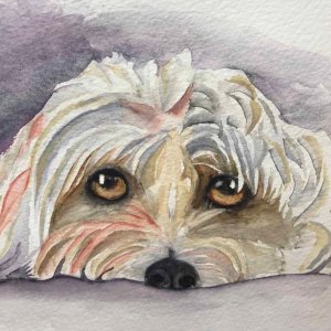
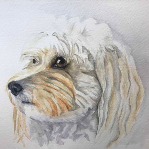
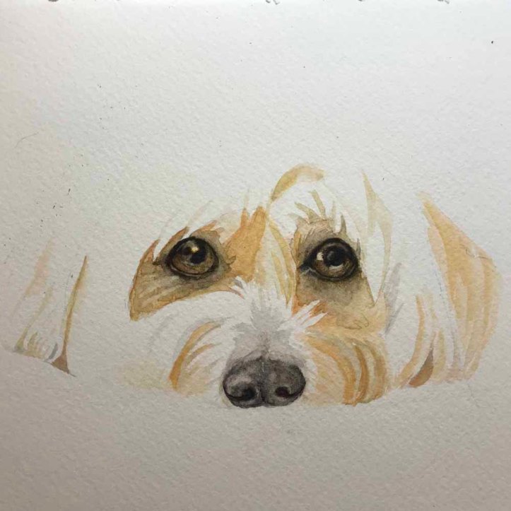
The last one, above here, I was happy with, and even now after a few years, I still have a very soft spot for, as I finally felt like I had painted a white dog.
So here is how I managed to go from waste bin fodder to something I was quite happy about.
It’s the reference picture. I would say that is the absolute most important thing. Getting a decent reference picture with decent lighting. The reference picture is key, and I hadn’t realised that, and I have to say the importance of that was never really stressed in the different places I went for advice.
I quite possibly spend more time trying to find a reference picture that resonates with me than actually painting. My main source for reference pictures is Unsplash or Pexels. There are many more, but these are the two main sites. Its worth bearing in mind, that of course, being the main sites, you can often see the same reference being used by other artists.
So recently, I found a great picture of a greyhound and that has morphed into one of my favourite dogs to paint and draw. Trying then to find a dog of the right colour, with the most attractive pose, and then with the correct lighting is time-consuming. I can spend hours looking for ‘the’ right picture.
I tend to use a very limited palette and have: two yellows, two reds and two blues – a warm and cool of each.
For example: Turner’s yellow or lemon yellow and yellow ochre, alizarin crimson and winsor red and ultramarine blue and Prussian blue. I always have a well of Burnt sienna and Cobalt blue to mix greys.
I have recently added, for convenience’s sake, Earthshine Violet and Indigo Blue, and I’ll always have a neutral or black available. I rarely use black except for pupils and nostrils ;-).
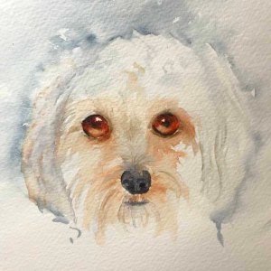
Below here are a couple more attempts, that I was happy with, but still hadn’t really achieved what I wanted, but I was satisfied that they were much better than the previous.
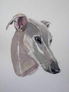
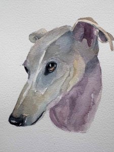
Below was what I finally felt was a successful white dog. Which, as you can see, isn’t really white at all; it’s a lot of grey. But that is the beauty of watercolour and painting really, its about what suggests something rather than it being blatantly it.
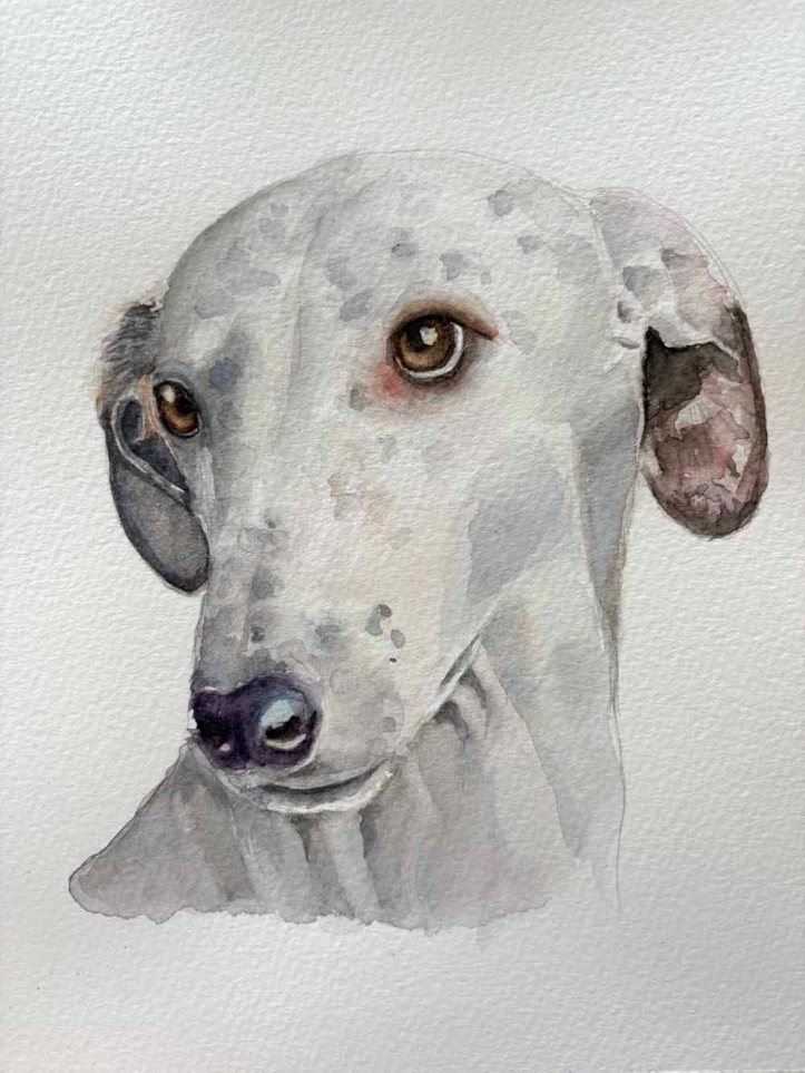
So, there you have it. Sticking power (maybe obsessively so), a good choice of colours and an excellent refeerence picture that helps you paint your picture rather than hinders it.

